In Military Intelligence School, I was taught to provide intelligence preparation of the battlefield based on the dimensions of Mission, Enemy, Troops, Terrain & Weather, Time Available, and Civilian Considerations (METT-TC). In studying marketing principles, I learned to provide macro-economic evaluation by the dimensions of Political, Economic, Social, Technological, Legal, and Environmental (PESTLE). In practice, I have combined the two methodologies as appropriate for my subject matter.
Sometimes I would combine dimensions in a geographic information system (GIS) like MS MapPoint to help identify the best location for a new store or for holding an event.
Sometimes, I used machine learning techniques to define algorithms based on things such as customer product use, payment methods, and demographics.
When dimensions were qualitative (such as a comparison of the words, recent actions, and personal history of a competitor's CEO), I have even used paper index cards to organize and make significant linkages.
Clients depend on me to identify the dimensions to evaluate to produce the answers needed. They also depend on me to find, prepare, and query the data needed, which I can do with my broad knowledge in diverse subjects and my skill and experience in research, programming, and databases.
Most of my work for clients has involved multi-dimenstional research & analysis. Showcased below are my best projects I am at liberty to discuss.
Identifying the best new retail site location
Anchor Bancorp (since acquired by Old National Bancorp) wanted to open a new bank branch in the outer ring of the Twin Cities. I researched several cities by combining:
US Census Bureau data ~ current and future transportation infrastructure ~ current and future business and residential development ~ current consumer and business customer locations ~ competitor locations
My research included interviewing city officials, driving and walking tours of the cities with a voice recorder, lots of photographs, and data analysis with a geographic information system (GIS).
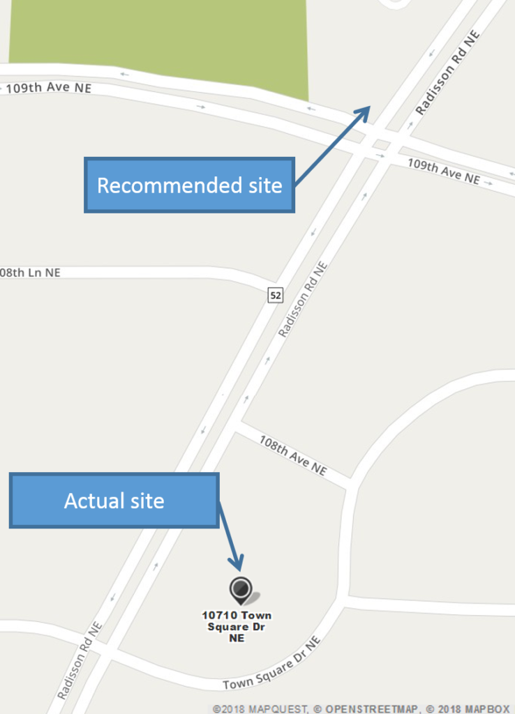
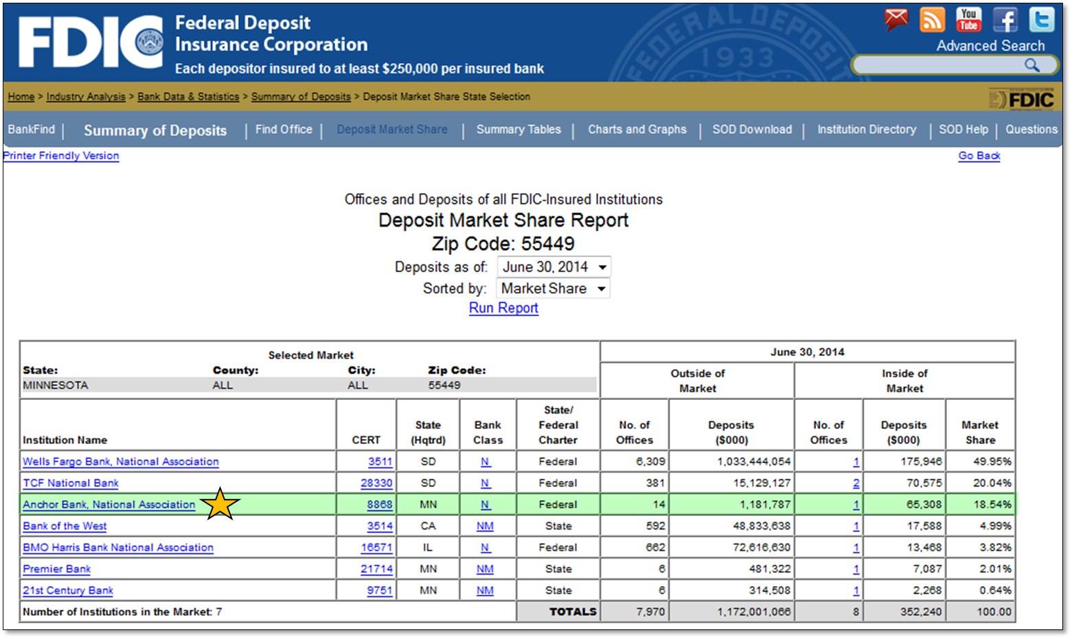
In my final report, I recommended one specific intersection in Blaine as the best location. In 2004 (two years after my report), Anchor opened a new branch 300 yards from that intersection: 10 years later it had become the third largest bank for deposits in Blaine (Zip code 55449), outperforming long-established competitors in the city. As of June 30, 2021 (after Anchor was acquired by Old National Bank), this branch was #2 in Blaine with almost 34% market share.
Work sample: excerpts from the referenced report (with emphasis on Blaine chapter)
Click the images left and below to see larger versions.
Minnesota Orchestra
Minneapolis, MN
Identifying best location for an event
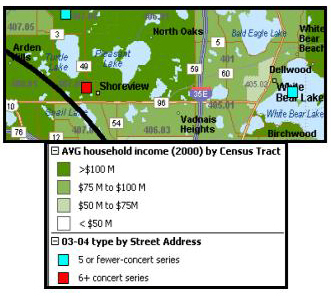
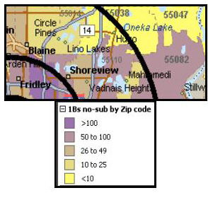
To study where the Orchestra's concert attendees lived in the Twin Cities and what characterized them, I used Microsoft MapPoint to overlay their home address locations with demographic data. I segmented concert-goers by whether they bought a season ticket package (subscribers) or only purchased tickets for individual concerts (single-ticket buyers) . My demographic data came from the US Census Bureau and various commercial sources. These demographics included household income, spending on entertainment, and presence of children, to name a few.
I noticed that the area around Shoreview, Vadnais Heights, and Mahtomedi had a high number of single-concert buyers, but almost no subscribers. Cost did not appear to be the issue because this area had a high percentage of households making over $100,000 a year (a lot of money back in 2004). By also plotting the distance from Orchestra Hall (shown by the black arcs in the graphics, left), I surmised that distance from Orchestra Hall dissuaded the people in this area from becoming season subscribers, a commitment of six to 24 concerts a season).
I therefore recommended to the Orchestra that when they planned “outreach” concerts around Minnesota, they should always include the Shoreview-Vadnais Heights-Mahtomedi area. Besides having a large receptive audience, there was the possibility of converting some single-ticket buyers into subscribers.
When the next season was planned for later that year, it included a “Close-To-Home” concert in Mahtomedi (at St. Andrew’s Church) — part of the Shoreview-Vadnais Heights-Mahtomedi area I had identified in my report. Because of its popularity (often selling out on the first day tickets were available), the concerts were increased to two per season.
YMCA of the North
Minneapolis, MN

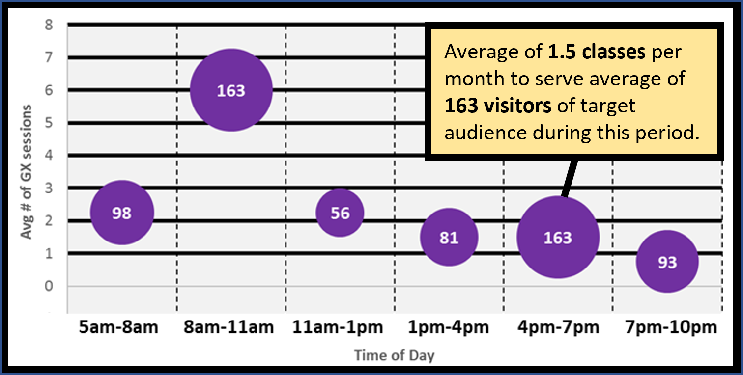
The greater the number of people in the target demographic visiting during a time of day (the purple bubbles), the more classes there should be for them during those hours (the position of the bubble on the y-axis). In the example above, the average of six classes from 8am to 11am appears sufficient for the average of 163 visitors in the target demographic during those hours (i.e., an average of 27 people per class assuming all 163 attend a class). On the other hand, the 163 people visiting from 4pm to 7pm are under-served with only 1 1/2 classes on average.
Are we using resources in the most productive way?
The YMCA of the North is the parent organization of 26 YMCA branches in the greater Twin Cities and Rochester, MN. Its branches offer different types of exercise classes designed for different types of members, such as senior citizens and families with small children. Are these classes being scheduled when their target demographic prefers to visit? During my two-year consultancy for the YMCA of the North, this is one of the questions I was asked to answer.
Collecting data for this research was simple, but it was not immediately obvious how best to present it for decision support.
I settled upon Excel's bubble chart as the best presentation method. The chart, left, is an anonymized chart for one type of class and one target demographic at one YMCA branch:
- The x-axis shows the hours when the branch was open. I chose the definition of each period (2 or 3 hours) based on the peaks and troughs in a histogram of visitor arrival times.
- The y-axis was the average number of classes of the type in question for the months under study.
- The size and label of each bubble reflects the average number of visitors of the target audience for each time-of-day period.
- The vertical position of each bubble corresponds to the number of classes (y-axis) available on average to these visitors during the time of day in question.
Using these charts along with my supplemental research, the YMCA of the North adjusted their class schedules at all their branches to better serve their membership. I was able to largely automate this analysis using MS Access and Excel so that my client could do periodic reviews on their own after my consultancy was completed.
Copyright Will Beauchemin 2024
